The Pumpkin
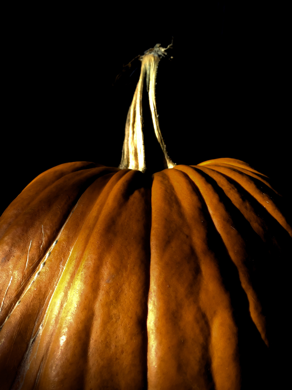
I took this photo of a pumpkin in my courtyard last weekend. I wanted a picture of a pumpkin because that’s a big theme of Autumn and I found some in my courtyard so I propped one up In front of my door and took a couple pictures. I found one picture that I liked quite a bit (this one) but the only problem was that the background was really ugly and completely ruined the picture. So after some editing I finally came to a conclusion that I liked. The darkness of this picture makes it look mysterious and “spooky” which I thought was perfect for Autumn as it is a “spooky” and mysterious season. Another nice thing about this photo that led me to choosing it for my website is how many different tones of orange there are all throughout the photo being separated by the dark, shadowy creases of the pumpkins.
While I was editing this photo my main concern was to change the background and bring out the darkness in the creases of the pumpkins. The background was originally dark grey with my doors pattern so making it black wasn’t too hard. I selected the whole background with the mask tool and brought the exposure all the way down so it was now black. Next, I brought the exposure down a tad on the whole pumpkin, brought the contrast up a tad, saturation up a bit and lastly added a little orange tint to it.
While I was editing this photo my main concern was to change the background and bring out the darkness in the creases of the pumpkins. The background was originally dark grey with my doors pattern so making it black wasn’t too hard. I selected the whole background with the mask tool and brought the exposure all the way down so it was now black. Next, I brought the exposure down a tad on the whole pumpkin, brought the contrast up a tad, saturation up a bit and lastly added a little orange tint to it.
Scenery
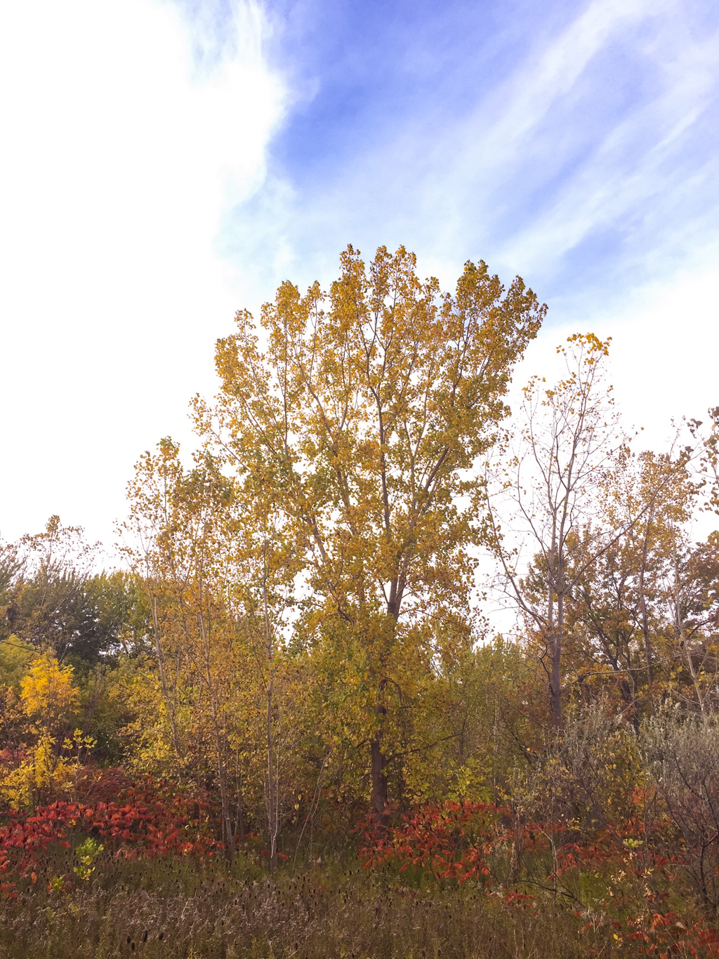
I took this photo while I was walking through gantachio trail with Jack last weekend. Among all the photos I took, this one stood out amid the rest of them. The colours that make up the photo were just too nice for me to leave out. The blue and purple sky, the yellow and orange leaves with red popping up here and there, the fluffy white clouds and the little hints of green throughout the photo made this one stand out. The variety of colours was too good considering autumn is based on red, yellow, and orange but here you have so many more different colours, shades, tones and tints to make this photo really POP. Overall, the main reason for me choosing this photo was the colour, I just love the combinations and variety too much for me to not include this picture.
Editing this photo was really really quick and easy as my only concern was bringing out the “autumn” colours more like red, orange, and yellow. All I did was turn the temp up to 12, the tiny up to 36, the vibrance up to 16 and the saturation up to 42. Then I finished it off by putting the clarity to 21, the dehaze to 27 and the vignette to 3.
Editing this photo was really really quick and easy as my only concern was bringing out the “autumn” colours more like red, orange, and yellow. All I did was turn the temp up to 12, the tiny up to 36, the vibrance up to 16 and the saturation up to 42. Then I finished it off by putting the clarity to 21, the dehaze to 27 and the vignette to 3.
Transition
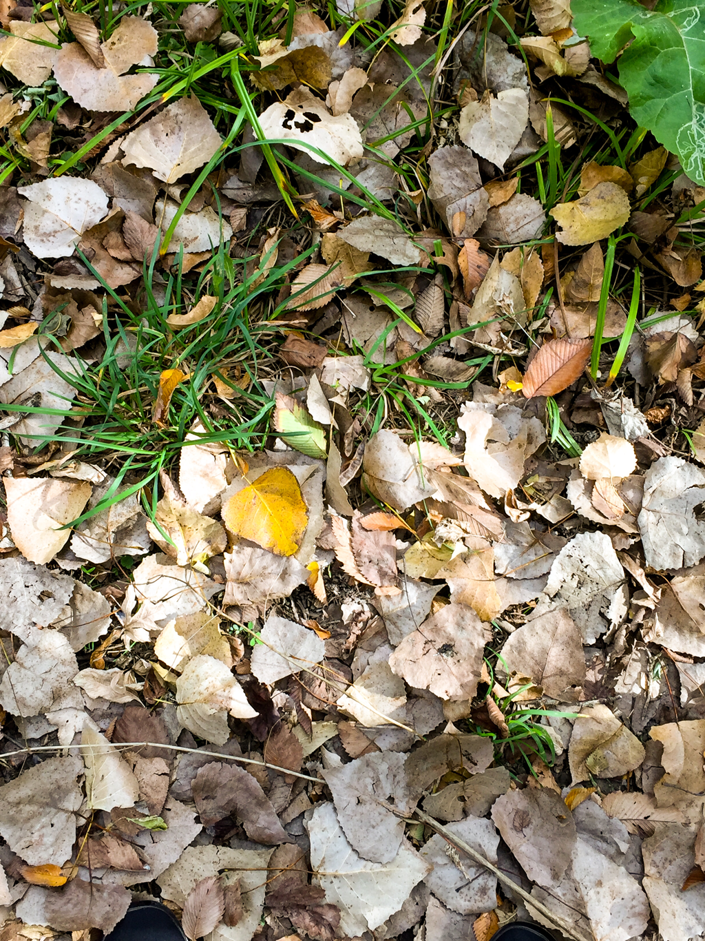
I took this photo of the leafy ground last weekend while I was walking throughout ganatchio trail with Jack. I chose this photo because it portrays the transition from summer to autumn. The upper half of the photo is vibrant, green, well and alive while the bottom half is brown, orange, yellow and dead. As you can probably tell, the upper half represents summer and the lower half represents autumn. The transition is in the middle where the green turns to yellow and the yellow turns to brown and dead. I thought that the transition was cool and decided it would look nice if I edited it to bring out certain things and crop it to only contain certain things. After I edited it I decided I wanted to use it as one of my autumn photos.
I started editing it by bringing exposure down to -1.44, putting contrast up to 21 and highlights to 20. Next I brought shadows down to -65, whites to 49 and blacks to -25. Lastly, I brought temp to 20, tint to 22, vibrance to 66 and saturation to 9.
I started editing it by bringing exposure down to -1.44, putting contrast up to 21 and highlights to 20. Next I brought shadows down to -65, whites to 49 and blacks to -25. Lastly, I brought temp to 20, tint to 22, vibrance to 66 and saturation to 9.
