Izaak
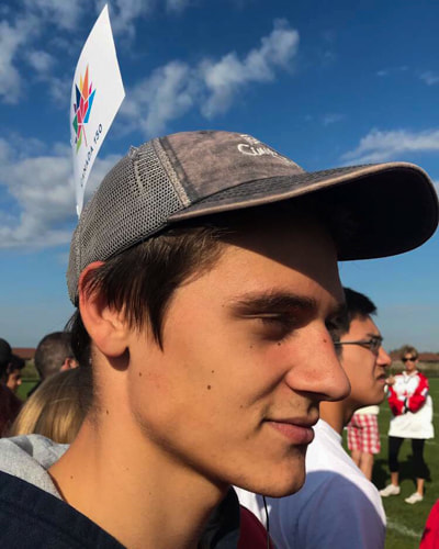
(LEFT) This is a photo I took of Izaak with a flag sticking out of his hat on Friday, September 29th during St. Joseph's high school's Canada 150 birthday celebration. I chose this photo because it expels the untroubled and goofy smirk on his face which represents how relaxed and amusing the day was. The photo also shows how everyone participated by wearing red and white and some people (like Izaak) even displayed their spirit by throwing flags over their heads, waving posters around or slapping tattoos on their arms among other things. Another reason I decided to choose this photo was because of the close angle and shallow depth of field which I thought made this picture stand out amid the rest of my pictures.
My main focuses while editing this photo in lightroom were cropping it correctly, finding the perfect white balance, and playing around with the clarity until I came to an edit that I thought looked nice. After uploading the photo to lightroom, I started by cropping it so the things that did not belong in the photo were gone, it was a tight crop but it got rid of things that made the photo ugly. next, i found the perfect white balance by using the "dropper' tool to find a neutral grey. Once i found the grey, I clicked on it and it balanced the blacks and whites so the photo would not have any ugly yellow or blue tints. Lastly, I turned the clarity down just a bit and increased the sharpness to retain the realistic looking texture in Izaak's skin.
My main focuses while editing this photo in lightroom were cropping it correctly, finding the perfect white balance, and playing around with the clarity until I came to an edit that I thought looked nice. After uploading the photo to lightroom, I started by cropping it so the things that did not belong in the photo were gone, it was a tight crop but it got rid of things that made the photo ugly. next, i found the perfect white balance by using the "dropper' tool to find a neutral grey. Once i found the grey, I clicked on it and it balanced the blacks and whites so the photo would not have any ugly yellow or blue tints. Lastly, I turned the clarity down just a bit and increased the sharpness to retain the realistic looking texture in Izaak's skin.
Action Shot
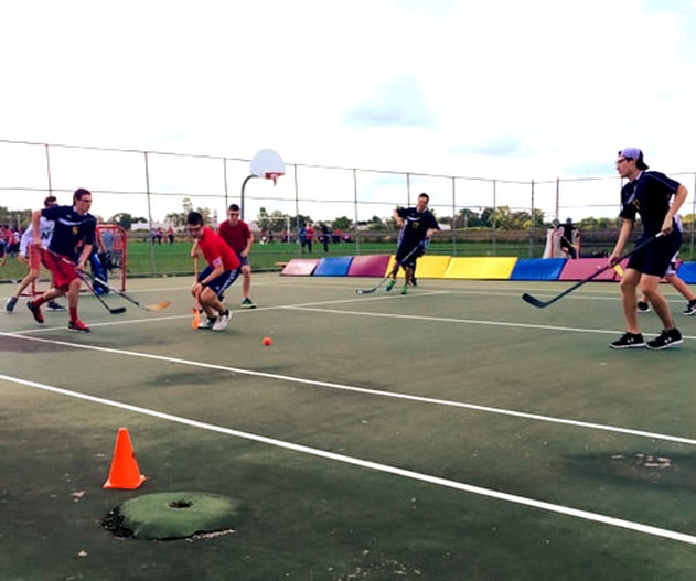
(RIGHT) This is a photo I took of a group of boys playing court-hockey on September 29th during the hockey tournament at St. Joseph's. I chose this photo because it highlighted the second part of the Canada 150 celebration; the hockey tournament! I really liked how this picture is like a visual representation of the phrase "keep your eye on the ball," as you can see the two boys on the left side of the photo with their eyes drawn dead on the orange ball. As your eyes follow the ball you then see that it is rolling along to the boy on the right. After this you may notice the boys in the back who are also following the ball and all the people in the far distance enjoying themselves to other activities. Basically, what I am trying to say is that this picture tells a story that I like about the day and that is why I chose this photo.
while editing this photo, I focused quite a bit on the cropping of it, the white balance of it, and the clarity and saturation of it. First, I cropped out the stray objects like hockey sticks and water bottles that did not look good in the photo. Next, I used the white balance "dropper" to click on the backboard of the basketball net to get a nice white balance as the backboard was a neutral grey. The photo originally was a bit grainy, so I turned the clarity down in attempt to fix the photo and it ended up looking a bit better than the original. lastly, I tried to make the colours POP by turning the saturation up a little bit.
while editing this photo, I focused quite a bit on the cropping of it, the white balance of it, and the clarity and saturation of it. First, I cropped out the stray objects like hockey sticks and water bottles that did not look good in the photo. Next, I used the white balance "dropper" to click on the backboard of the basketball net to get a nice white balance as the backboard was a neutral grey. The photo originally was a bit grainy, so I turned the clarity down in attempt to fix the photo and it ended up looking a bit better than the original. lastly, I tried to make the colours POP by turning the saturation up a little bit.
Friends
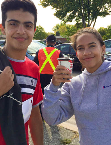
(LEFT) This is a photo I took of Megan and Shacker on September 29th at the corner of Tecumseh and Forest Glade while they were guiding St. Joseph's annual Terry fox walk. I chose this photo because I liked how everything was placed in this photo with the police officer in the back to make it pop. The way the two friends are standing gives some symmetry to the picture making it nice to look at. To me, there wasn't too much about the photo that made me feel some way, instead I just chose this photo because of the visual.
I focused a lot on cropping and white balance as well as contrast and saturation while I was editing this photo. The first thing I did was crop it so the little sliver of the girls phone was out of the picture. Next I cropped out the waists of the two to add some eveness to the picture. Then I found a nice white balance with the "dropper" tool on the girl's hoodie. Next I threw up the contras and saturation just a tad to bring out all the colours and after that I was done.
I focused a lot on cropping and white balance as well as contrast and saturation while I was editing this photo. The first thing I did was crop it so the little sliver of the girls phone was out of the picture. Next I cropped out the waists of the two to add some eveness to the picture. Then I found a nice white balance with the "dropper" tool on the girl's hoodie. Next I threw up the contras and saturation just a tad to bring out all the colours and after that I was done.
